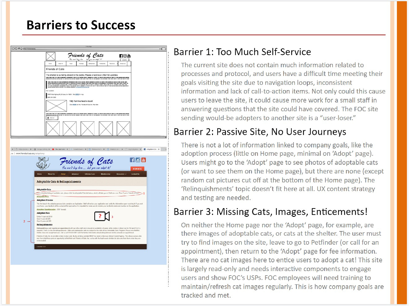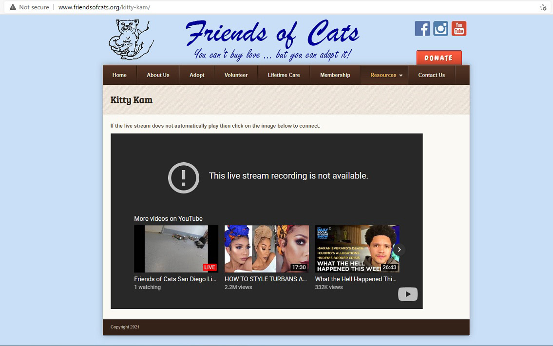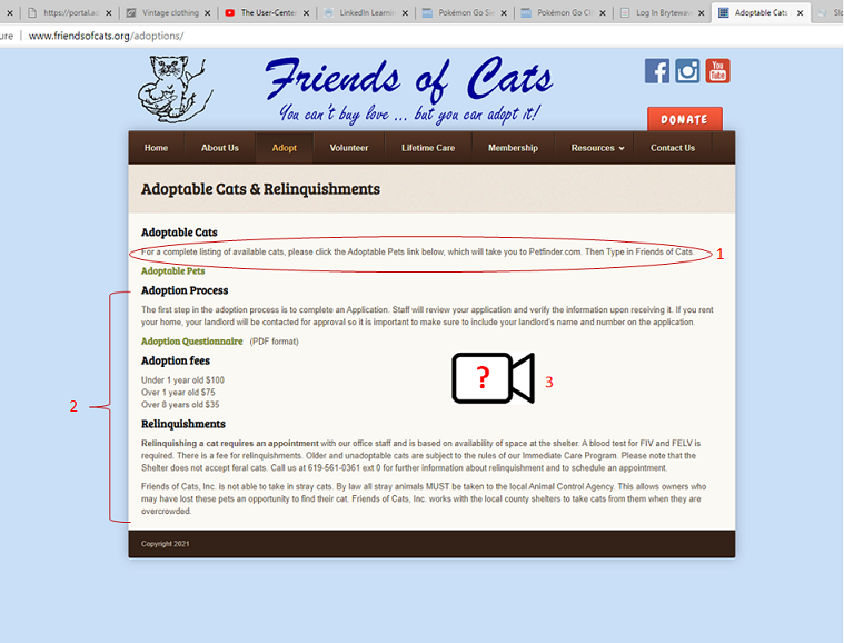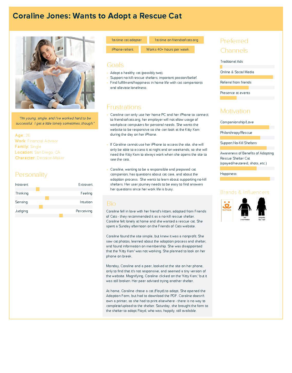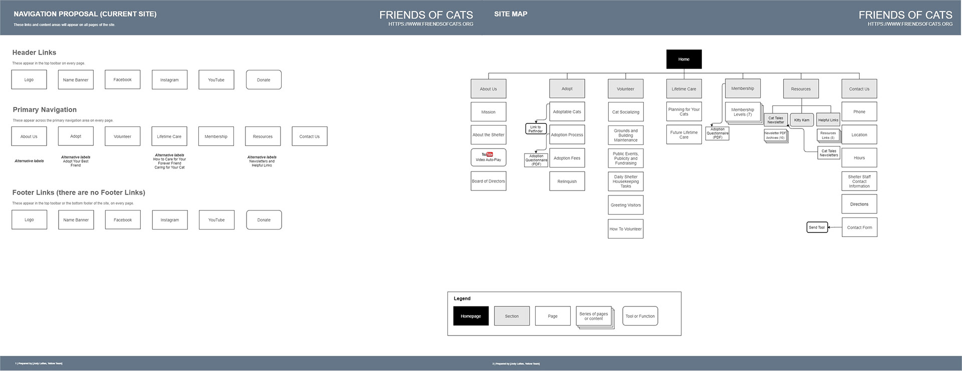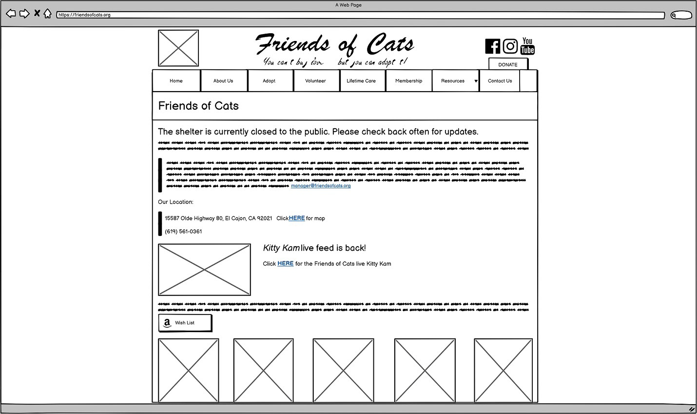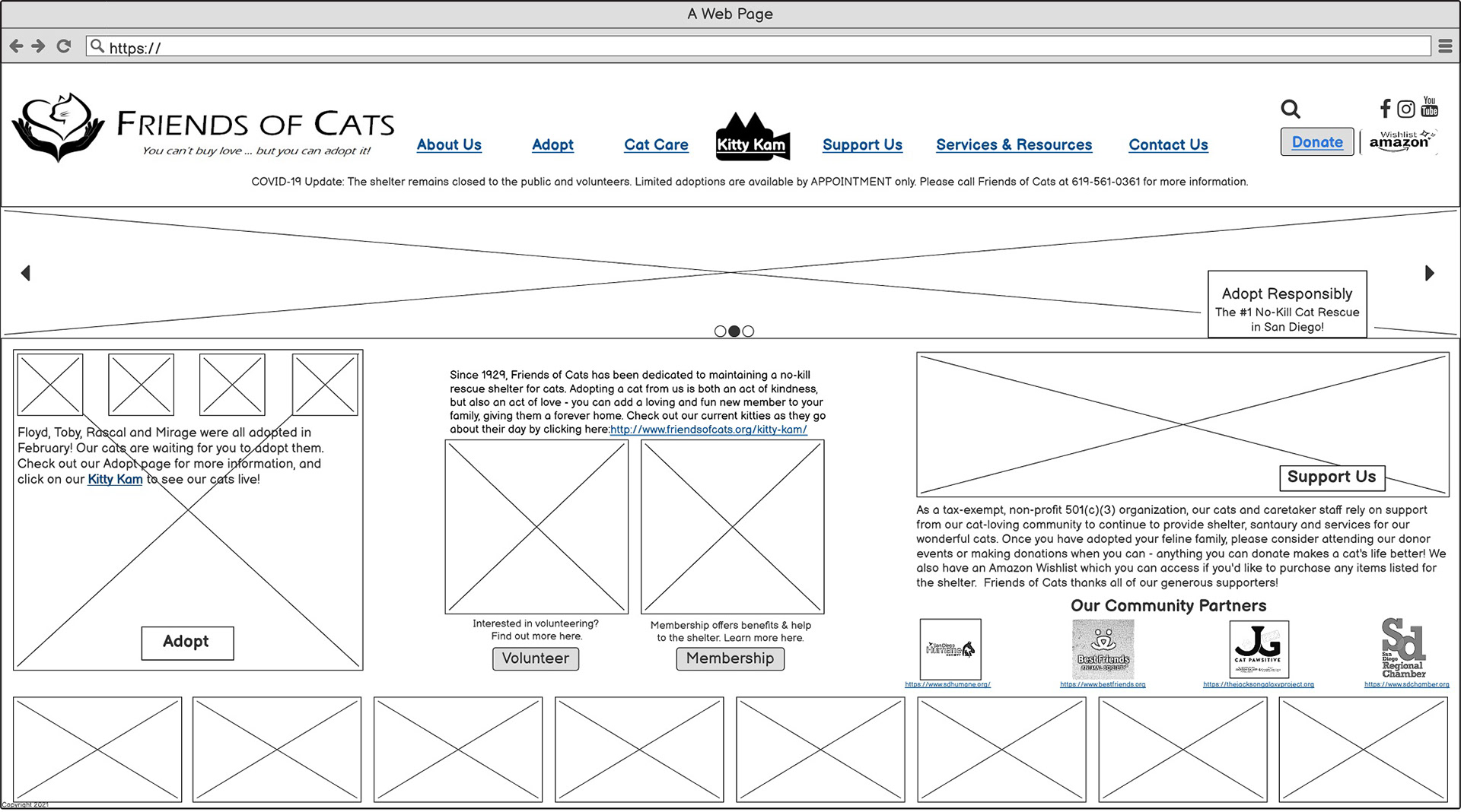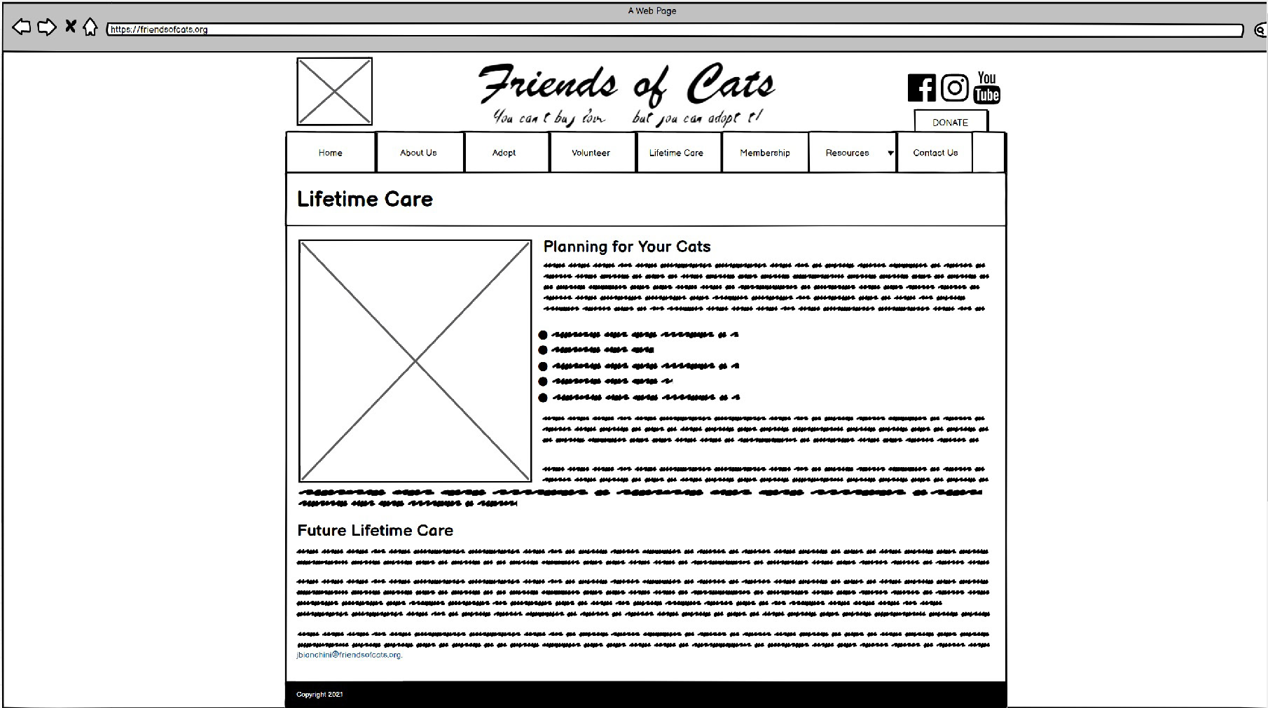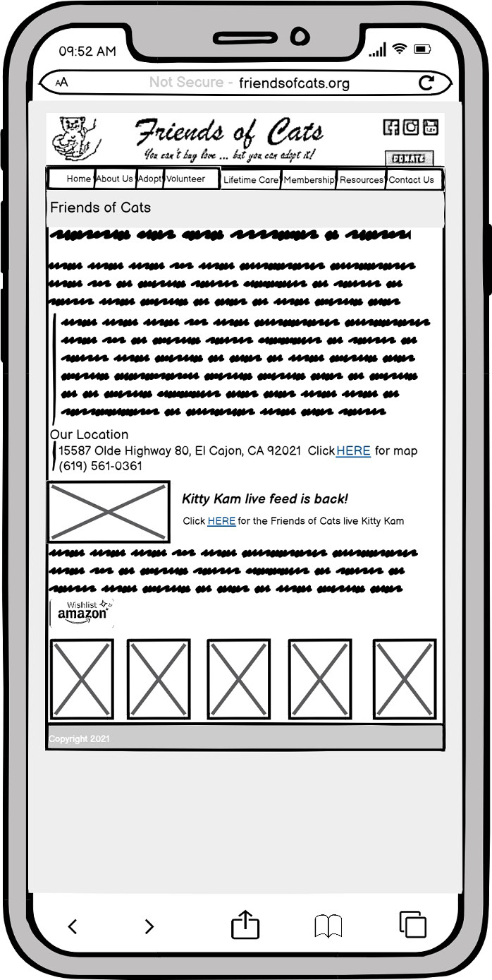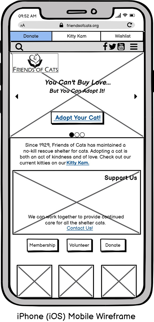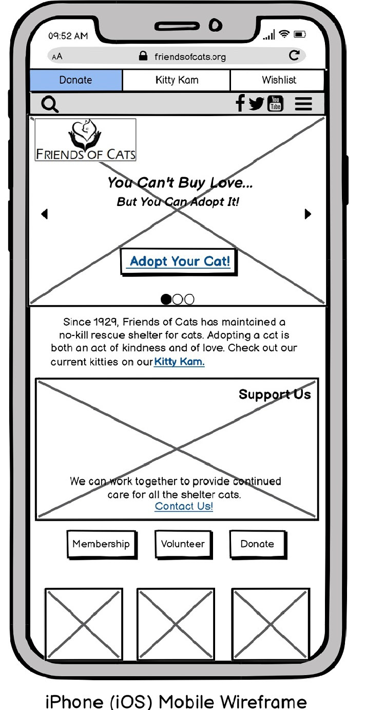


In January 2020, a no-kill cat shelter in San Diego called Friends of Cats (FOC) contacted my team for a website structural upgrade and move to adaptable design, as they'd been using the same website since the early 2000s and it was confusing visitors and functioning poorly. Our team conducted a full UX research and design process, conducting user tests on the old (or current-at-the-time) website, involving users in ideation and brainstorming for features and aspects of the user journey and goals that might make the website easier to use, without losing some of its beloved features. We used Qualtrics to conduct a survey of more than 50 people from 6 states, and from that gathered 6 people for user testing interviews. We researched multiple other no-kill shelter sites from all over the United States as well, to get a feel for what works well and what does not. With this research, we crafted personas to inform what kind of user journey might resolve some of the problem statements we found in our research. Our design question was: How can we design a way for navigation and functionality of FOC's website so would-be adopters will have an easier time learning about adopting and caring for cats, and for adopting cats? We needed to address three barriers to success we identified: first was that the original site had too much self-service, making navigation confusing. Users like a choice but they also want structure and more call-to-action (CTA) items. The Second was that the site was passive - we could not draft a user journey due to inconsistencies, dead ends, missing pages, and other issues. Third, third, there were very few images on the site, which stood out from other sites, where shelters really want cats to be adopted. For a more interactive site with regular image changes, we would have to train the FOC staff. Even the fonts and logo for FOC looked dated, so the redesign was going to be a thorough one. Based on our personas and user testing, we analyzed the wireframe and old site to determine what features we'd keep and to analyze copy to be saved, etc. Then we created a wireframe for a redesigned site - for both desktop and mobile devices, and the old site was not adaptive. I developed an updated logo that kept the feel of their original logo, which FOC loved. We determined a design structure and type library that was clean and image-prominent, with many CTAs and simplified navigation. We used the final wireframe for usability testing, and it was well received. FOC was happy with the work and hopefully went on to work with a design/development team to complete it. Once the wireframe iterations were presented and a final was approved, we developed a site map as well
